Typography This week, we learned on how to make our own font using adobe illustrator. Firstly, we were asked to type "happy" with the font provide then after resizing it, we had to make all the letters become a symbol. After that, we can edit each letter and also the font design has to be related to the mood of the word. For the first word which is "Happy" I make it very simple by using a light blue color and I changed each individual letter using warp, pucker and bloat tool. Then, we were asked to create another word and I decided to make : This is the first word that first came out in my mind when we were asked to create a new font with a new word. I am still using blue for this word because I love blue and it relates to the word itself. I used twirl, pucker, bloat and also warp and wrinkle tool to create a melt effect on each letter ( I relate it with the word "cold") and this is the final outcome of my font. I had so much time doing this, I did not find any difficulty while doing this and I am glad to gain new knowledge.
2D and 3D Plane (Visual Perception) This week, we were asked to bring 3 pieces of paper with 3 different colors, a tape and scissors to lecture class. I honestly had no idea what am I going to do. Turned out, it was a was all a class exercising that miss Ivy made to explain the concept of Visual Perception. I had no idea what it is about until I completed the exercise. Here are the steps : We were asked to take 2 pieces of papers (I chose yellow and pink) and cut one of the papers to 4 small parts with same size and we had to attach it t the big square paper and it will turn into something as the picture below. Then we learned on how to fold a crane. Honestly, I have made this for several times but never remember on how to make it and I always have a hard time doing this. Ms Ivy then started explaining the concept of "Visual Perception" by instructing us to write key pointers on different parts of our folded art-piece.
VISUAL PERCEPTION Visual perception is a function of our eyes and brain. We see the images as a whole rather than in parts. However, images can be broken down into their visual elements: line, shape, texture, and color. These elements are two images as grammar is to language. Together they allow our eyes to see images and our brain to recognize them. There are two types of objects in this concept 3D and 2D . There are 3 concepts of 3D which are distance, depth and size or space.
There are 8 principles in visual perception:
1. Orientation
2. Illusions
3. Position
4. Light/ Brightness
5. Monocular Cues
6. Binocular cues
7. Motion
8. Time
These are the explanation :
Orientation
- An object's orientation may be left, right, middle or justified.
- 'Relative size' is the use of other, or nearby objects to judge size in relation to them. Objects that produce the largest image on the retina are perceived as closer and images that produce the smallest image are perceived to be further away.
Illusions
The concept of 3D and 2D creates illusions. Time and motion together equal to illusions.
Position
- depends on the setting and theme, 2D, 3D.
- 'Linear perspective' can be created by placing the parallel lines as they recede into the distance (thus provide information about depth and distance). The presence of a detail, aerial and linear point, all converging to meet at a V-point will create a linear perspective.
-An 'interposition' will occur when an object is obscured or blocked by one other object (close).
Light/Brightness
- The rules is Color = Value. So for example I used pink, yellow and green to make formy folded pieces to 'value' which comprises of 'texture gradient'.
- Texture gradient : the distortion in size which closer objects have compared to objects farther away, and it is based on the blurriness and transparency of details.
Monocular Cues
- The judgement of distance and depth using one eye (linear).
- 'Partial overlap' happens when a 2D figure overlaps with a 3D figure.
Binocular Cues
- Binocular cues are depth cue which results for both way of seeing (both eyes).
- Binocular cues allows us to have a 3-D object using parallax dispirit and the convergence of the extra ocular muscles.
Motion
- The concept would be time plus motion equal illusions.
- It is human nature to perceive something in expected way and applying certain expected order as well.
Time
We read in chronological order. For example, since we were a kid, we had always been taught to read from left to right. Therefore, we perceive objects in the same way.
Hence, this method of learning is very easy and simple to understand, it does not take much time to do another things lie this. I could remember things faster and more sufficient, thanks for the knowledge miss Ivy.
before after | What a 'Challenge' When I first opened the Quiz Folder at Times, I was really shocked to see this photo, and even worse when I realize that this is the picture of Victoria Beckham, one of the fashion trendsetter around the world. I am still curious whether this is her real skin or not. However, my biggest fear was I have never done any makeup in my life, my knowledge about makeup is definitely zero. I was really afraid if the result would look like a clown, so I started to define my own definition of how a girl should use a make up. I dislike girls who put too much makeup on her face, and I also like a classy girl.
From there, I try to watch several makeup tutorials on YouTube, browse some transformation picture of someone who use makeup. Then I started working on my Quiz 1, after correcting all the blemishes on her skin, I spent almost 2 hours experimenting with the brush and put on the eyeliner, blush on and lipstick. The color did not match at all and one of my friend said, whenever I put a makeup, the best way to do it is by imagine myself doing a painting on a canvas. Then, I started putting a blush on her cheek, then put on her lipstick that match with her skin and the blush on color. After that, I decide to do a little face lit on her face. If you look carefully, her eyes are bigger and her nose is thinner than the original, then I add on a light brown contact lens and apply the eyeliner (I repeated for more than 10 times doing this) and I used a dark brown accent for the eyeshadow to keep her face looks natural.
I also polished up her eyes with more, thicker and longer lashes and this is probably the most challenging part because I really want to make sure that the lashes is falling in the same direction and the tilt is also perfect. For the hair itself, I gave a light aqua blue accent to match it with the earrings ( which I think really looks expensive) and the lower eye shadow of her eyes. Finally, I add the straw and give a white gold vibrance to complete her look. I put so much effort doing this Quiz, and I think a junior "online" makeup artist, I did a not really bad job. I am happy with the result :) |
before after | Illustrator Art Piece This week, we were given an opportunity to work on a new project with a new software that we just learned which is Adobe Illustrator. I faced tons of challenges while doing this assignment, first it was my prime time using Adobe Illustrator, even though I have done several editing projects using pen tool on Adobe Photoshop, I still found it is kinda hard to use because it takes a lot of time to get a perfect result, I have to be very careful while tracing each part and edge of the object in order to produce a great result. Moreover, I had to think on color scheme and shape that could suit the "Gundam" best.
After spending several hours browsing and thinking, I came up with the idea of black and red color theme for my gun dam because both colors represent a power, confidence and persistence. I also add on a yellow color to polish my Gundam because yellow is very eye catching and has really contrast yet suitable with red and black, yellow also means protection. These are basically the quality that I want from my Robot or "Gundam".
Honestly, this is probably the most challenging artwork so far, it takes so much time to think and to finish this project. However, I am quite happy because once again I could learn a new software and knowledge that would be very useful for my future. Nonetheless, I have learnt so many things from this project from being creative, patient and conscientious in doing something. Thus, even though I know this is not perfect but I am satisfied with the final outcome, it is not just a plain artwork, but it has a meaning and message behind. So, yeah hardwork does pay off.
|
| | REFLECTION This week I learned the details of Graphic Design's principle which consists of contrast, repetition, alignment and proximity respectively. We were given several pictures and has to judge whether the design using these 5 elements or not and i am still analyzing and learning more about these principles of graphic design. I also learned several important knowledge about color, alignment, repetition on design. Beside, I also catch several important points this week, first in every design that we make, there should always be a message behind it so that the audience will not just see the artwork as an "art work" but also as something that has a value and story. Secondly, I also learned that white space is really important because the audience needs a space for their eyes to get a rest, so do not design something overloaded. Thirdly, always do everything attractively, try to be careful and detail while creating something. Hence, I have learned so many things this week that is very useful for me to create a good illustration and design, and always remember to include all the elements that has been taught to me.
|
click to enlarge the picture click to enlarge the picture
| REFLECTION
This week was really challenging because we were given a task to find several pictures and illustrations without taking it frointernet. So I have to buy several magazines, borrowed my design friends' work and took lots of brochures from anywhere. The hardest part was to find the vector illustration because I did not have a clear idea about vector design and I was struggling for 2 days but then I did a research to find out more about vector design and finally I could pick 3 best vector illustrations (in my perspective). This assignment gives me a clear idea about caricature, poster design, technical drawing, hand paintings, etc. I really had a great time observing all the artworks especially about the technical drawing because I have always felt curious about how these advanced complex masterpieces created and it obtains my knowledge about the design industry and I really want to explore and learn more about it all.
|
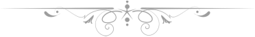
" Click to see a larger version" | Create and Design Oxford dictionary describes the word" design" as a plan or drawing produced to show the look and function or workings of a building, garment, or other object before it is made. While the word "create" defines as bring (something) into existence. To sum up, Design and create are an activity whose purpose is to produce and establish the multi-faceted qualities of objects, services, in life cycles. Therefore, design and create are the central factor of innovative humanization of technologies and the crucial factor of cultural and economic exchange ( ICSID,2013). My illustration about " create and design" symbolize their existence as a lighter to the universe that opens every human eyes so that they would be able to see the greatness of the world that design and create give.
References :
oxford dictionaries. (). oxford dictionaries . Available: http://oxforddictionaries.com/definition/english/create?q=create. Last accessed 11th april 2013.
oxford dictionaries. (). oxford dictionaries . Available: http://oxforddictionaries.com/definition/design?q=create. Last accessed 11th april 2013.
|
(click to see a larger version) | First Week This is my very first week of second semester after 3 months holiday. Honestly, visual communication is one of my top 2 subjects that i am very excited about, because some of my fiends took this subject last semester and I am so amazed to see them being able to create so many design with various software that they did not ever know before. After attending the first lecture, i was not disappoint at all, seeing the module outline and the way the lecture explains the lesson was very creative and communicative, especially when we were asked to take out a piece of paper and just did whatever the lecture asked us to do (create and draw a text with shape, texture, color, etc) and it was a great way to explain a material, because i could remember the elements, principal of art easier. To sum up, i got a brief and rough visualization about how this class and lesson is going to be, and I am super excited to see how my design skill will grow. |
|


 RSS Feed